
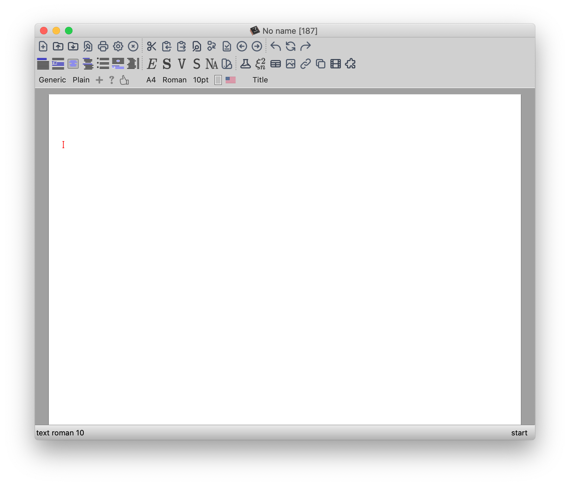
I’ve made a small experiment to have more streamlined icons. Comments are welcome. For some reasons I still do not understand I cannot yet make the main toolbar icon smaller, but ideally they should have the same size as those of the mode toolbar.
An experiment with UI icons

4 Likes
4 Likes
That looks awesome, love it!
Is the colour difference between the new icons and the old icons intentional? I guess it could make sense to keep the icons for italics, bold, etc. in black, as they represent text which is usually black. But then I would make the “table” icon also black (perhaps also the “image” icon).
1 Like
Not really, I’m progressively working on the icons. Probably it makes sense to uniformize the colors. There are many icons and I want to get a global feeling before going to change them all. Glad you like it. I will post soon the icons on tm-forge so that we can try them on different systems.
They are now on tm-forge
https://github.com/texmacs/tm-forge/tree/main/miscellanea/post-modern-icons
@jeroen, can you post a screenshot for Linux here? I’m curious to see the effect. Thanks!
I like this new look: it’s fresh and modern.
Thanks
1 Like
@mgubi They look great, thanks a lot!
It would be nice to be able to just copy / link the post-modern folder and have a preference to switch from different icon sets, but I’m not sure if I want to go down that rabbit hole 
3 Likes
Thanks, @mdbenito. I’m not at home, so can’t try myself right now.
The spacing between icons somehow looks a lot different than on Mac OS.
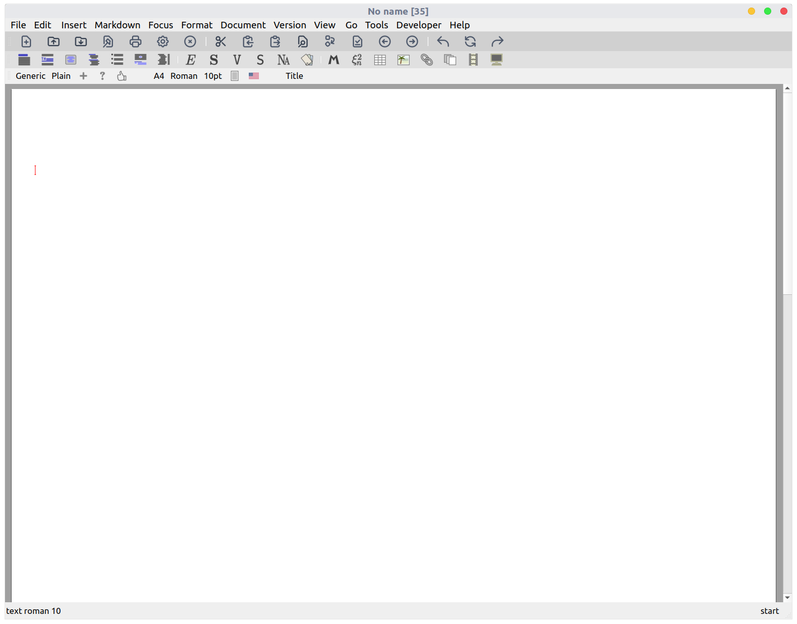
Myself, I’m using a tweaked Qt6 version. The code has become a mess with pixel tweaks here and there. I would like to find a better solution for the next interface. Anyway I’ve added some more icons. Comments/critiques welcome. I’m still not very satisfied with some of them.
Which one in particular ?
The group of four arrows in the left side of the focus bar.
For what my personal opinion worth: I like them too
1 Like
There is no support, as far as I can see, for alternate icon sets. But should not be difficult since the paths are not hardcoded and the system variable TEXMACS_PIXMAPS is used to resolve the filenames.
But maybe we should leave these large cosmetic changes at some later time. Power users can just download and add the icons if the like.


Nice! I was wondering whether to use colors or not. They looks good. One suggestion: I would keep the mechanical wheel simple with only one circle, not two. And I would not use two colors for the scissor, since there is no real distinction between the two components. I was also wondering if use a square box for the forwards/back/reload buttons, to make them different from undo/redo (or use other symbols for undo/redo). If we label correctly the components in the SVG files (e.g. use different layers), then will be programmatically easier to switch from a monochrome to a bichrome theme (also we need to consider the possibility to create out of them a dark-theme). Btw, I’ve updated the icons in tm-forge, it seems you are using an old version.
1 Like