Hey Everyone,
First up, I really like TeXmacs and I think that its interface is quite smart.
This is not a development thread, as revamping it would be a large task. I was just asking myself it it could be better and would love to know your opinion.
There are some things that I find a bit annoying about the user interface of TeXmacs and I would love to know if I’m the only one who thinks that way and if (maybe some day in the future) some work on this could be done:
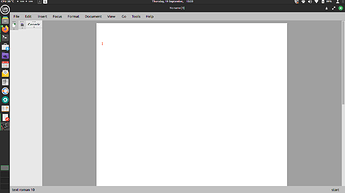
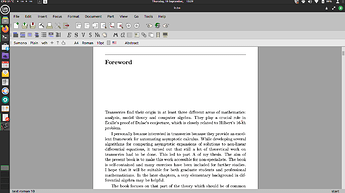
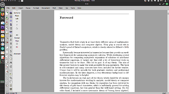
- The user interface takes up a lot of vertical screen space, which is not ideal especially when working on a document, on a laptop
- This is not really a problem with TeXmacs, rather with Qt: Qt tries to look native on all platforms, but it is not really good at it, leading to illegible results sometimes
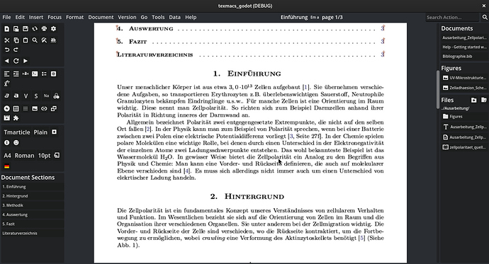
- I found that navigating larger documents can be a bit of a hassle, when jumping to different sections. Something like what Overleaf does could be nice
- this is very subjective, but when working with multiple documents and figures, I like to have an (optional) overview on the side to keep track of everything
- some actions that are rarely used are sometimes difficult to find. Having something similar to Word where you can type the action that you want to perform could be handy sometimes.
That said, I made a first mock ui (that isn’t functional yet) and I would love to know what you think.
Is it too overwhealming, does this make sense? Would this be an improvement or worse?
The placeholder icons are taken from Papyrus.
Please tell me what you think, how it would be improved, if you think that this is unnecessary, etc.
thanks 


